San Capri was conceived as an iced tea brand with a strong lifestyle component. Rather than positioning itself purely around the functional qualities of tea, the brand aimed to sell a feeling — sunshine, leisure, colour, and refreshment.
The task was to develop a visual direction for the brand, from its identity and colour system through to packaging and social-facing applications. The goal was to create something that could stand confidently on a shelf while also feeling natural within the visual language of contemporary lifestyle and beverage culture.
The Challenge
The challenge was finding the balance between craft and playfulness.
Iced tea occupies an interesting space between soft drinks, juice, and more premium wellness-oriented beverages. The identity needed to communicate refreshment and flavour immediately, while avoiding the visual clichés commonly associated with either category.
The bigger question became:
How do you make a simple iced tea feel like an experience?
San Capri needed a visual language that could feel premium without becoming overly polished, colourful without becoming childish, and expressive without losing clarity.
Discovery & Research
The discovery phase focused on understanding the visual territory surrounding contemporary beverage brands — particularly how colour, typography, illustration, photography, and packaging are used to communicate flavour and lifestyle.
Rather than treating the product as simply iced tea, I approached it as a summer lifestyle brand.
This led to exploring references around Mediterranean summers, fruit markets, vintage travel ephemera, sun-faded colours, contemporary editorial design, and the visual language of modern craft beverages.
The research ultimately pointed toward a direction that felt warm, tactile, colourful, and slightly nostalgic, while still maintaining enough restraint to feel contemporary.
The Design Process
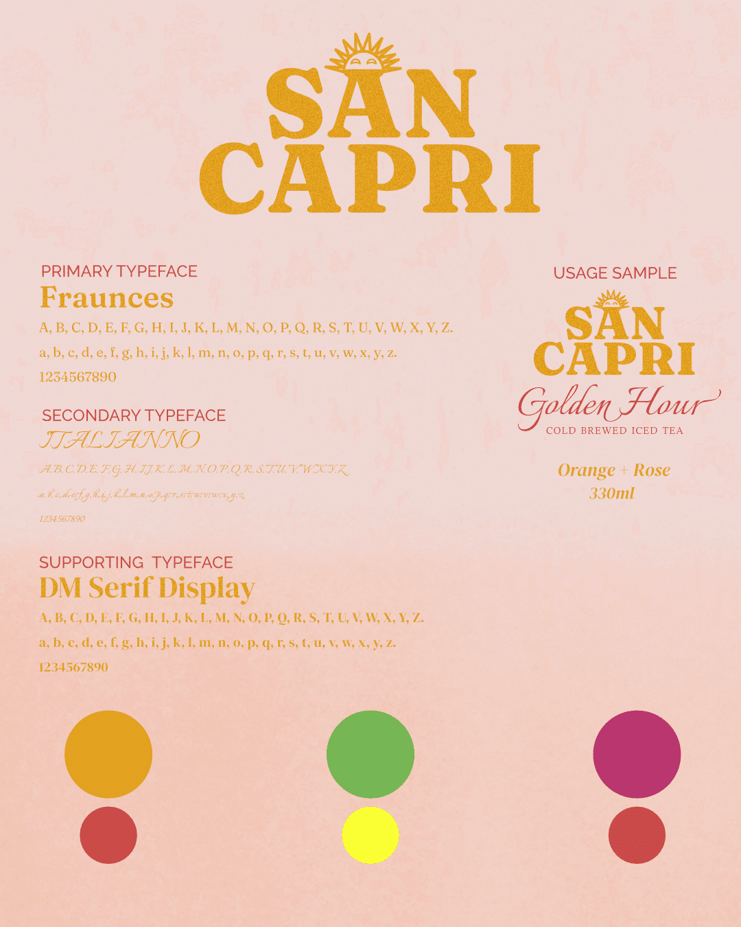
The identity was developed around a visual system that could stretch across the brand rather than relying on a single logo or graphic device.
Colour became one of the strongest tools for differentiating flavours and creating an immediately recognisable shelf presence. Typography was paired with expressive graphic elements to give the brand a personality that felt both crafted and energetic.
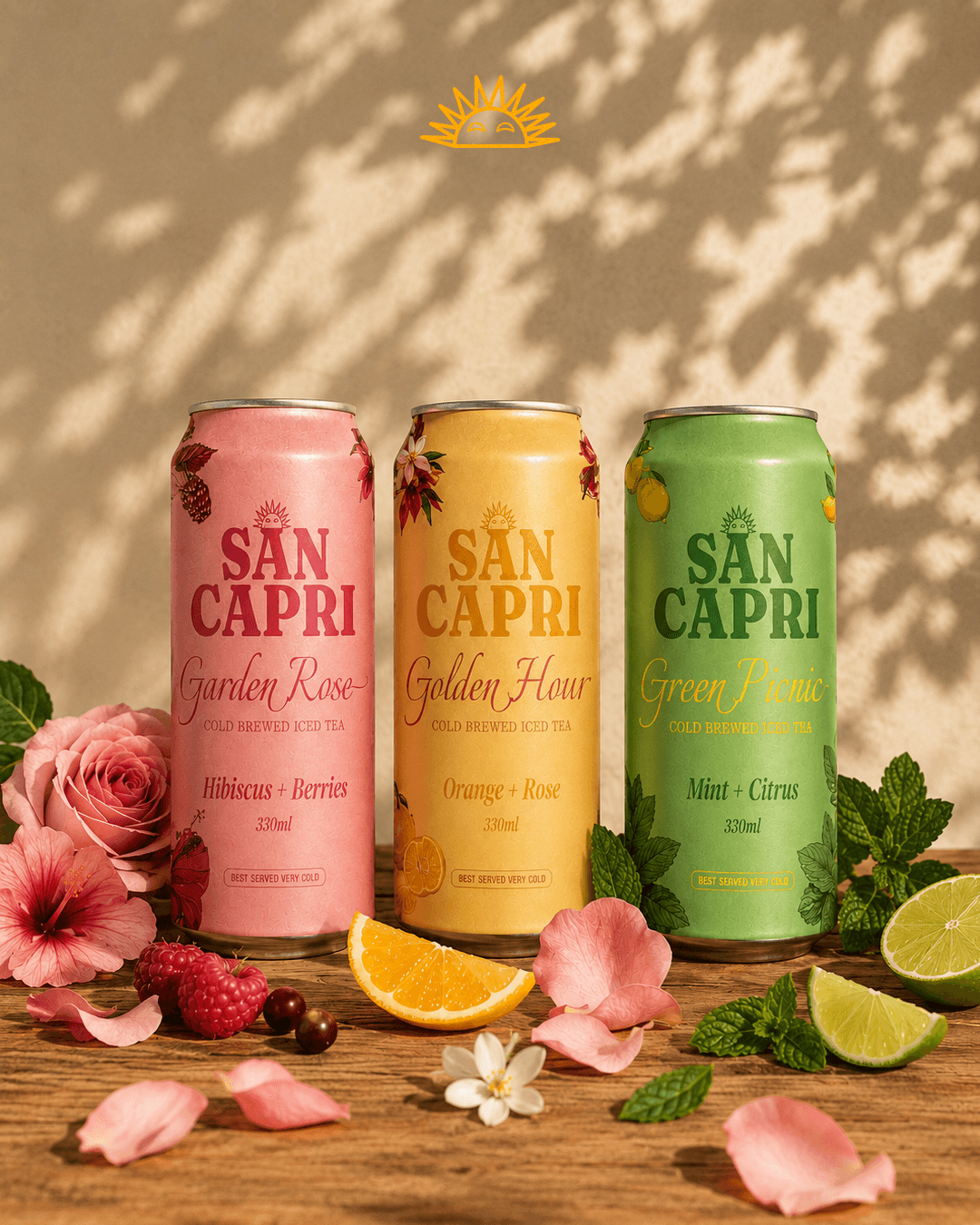
From there, the system was translated onto the cans, using the packaging as the primary storytelling device.
I also explored how the identity could live beyond the physical product — considering product photography, social media compositions, promotional graphics, and other touchpoints as part of the same visual ecosystem.
The result was a system designed to make the drink feel as refreshing visually as it is conceptually.
Outcome & Reflection
The final direction established San Capri as a colourful, character-driven iced tea brand with a strong visual presence.
The packaging gives each flavour its own personality while maintaining cohesion across the range, creating a system that can scale as the product line grows.
Beyond the cans themselves, the identity provides a flexible foundation for digital campaigns, social content, promotional materials, and future brand applications.
The project ultimately became less about designing an iced tea package and more about creating a world that the product could belong to.
The biggest takeaway was the importance of identifying the emotion behind a product before deciding how it should look. Tea, fruit, and refreshment are all easy visual cues to reach for, but they aren't necessarily what makes a brand memorable.
By starting with the feeling San Capri wanted to evoke, the design could become more intentional — allowing colour, typography, packaging, and imagery to work together as one experience.
The result is a brand that communicates what San Capri feels like.