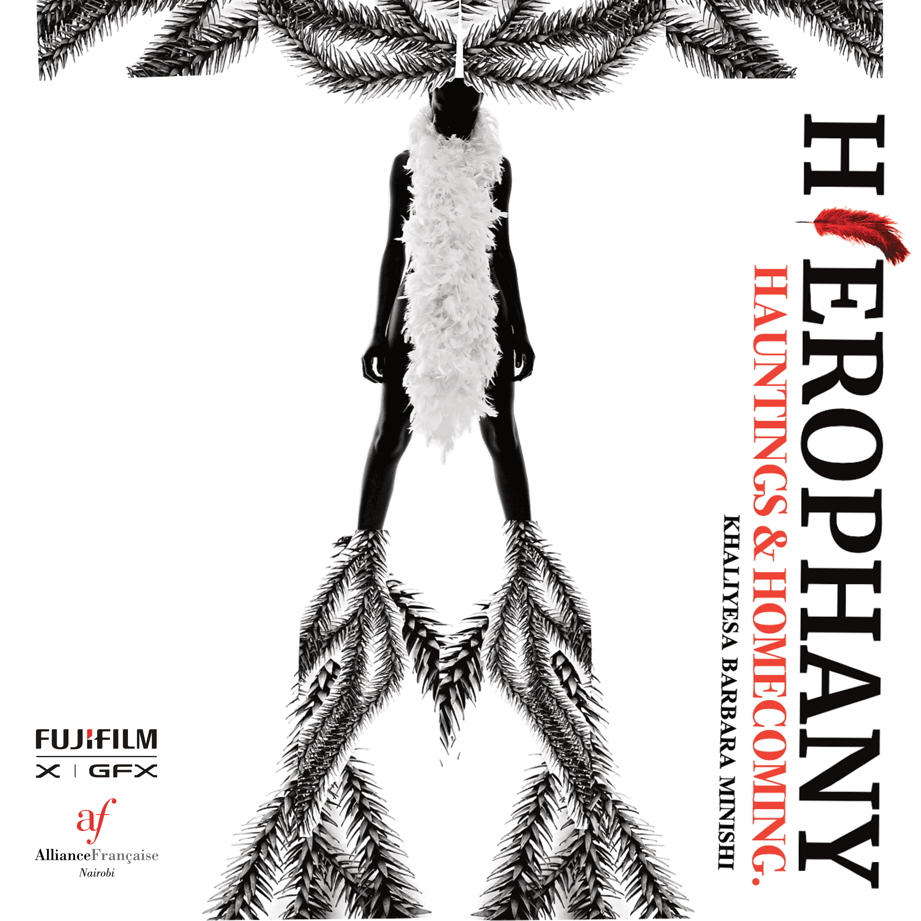
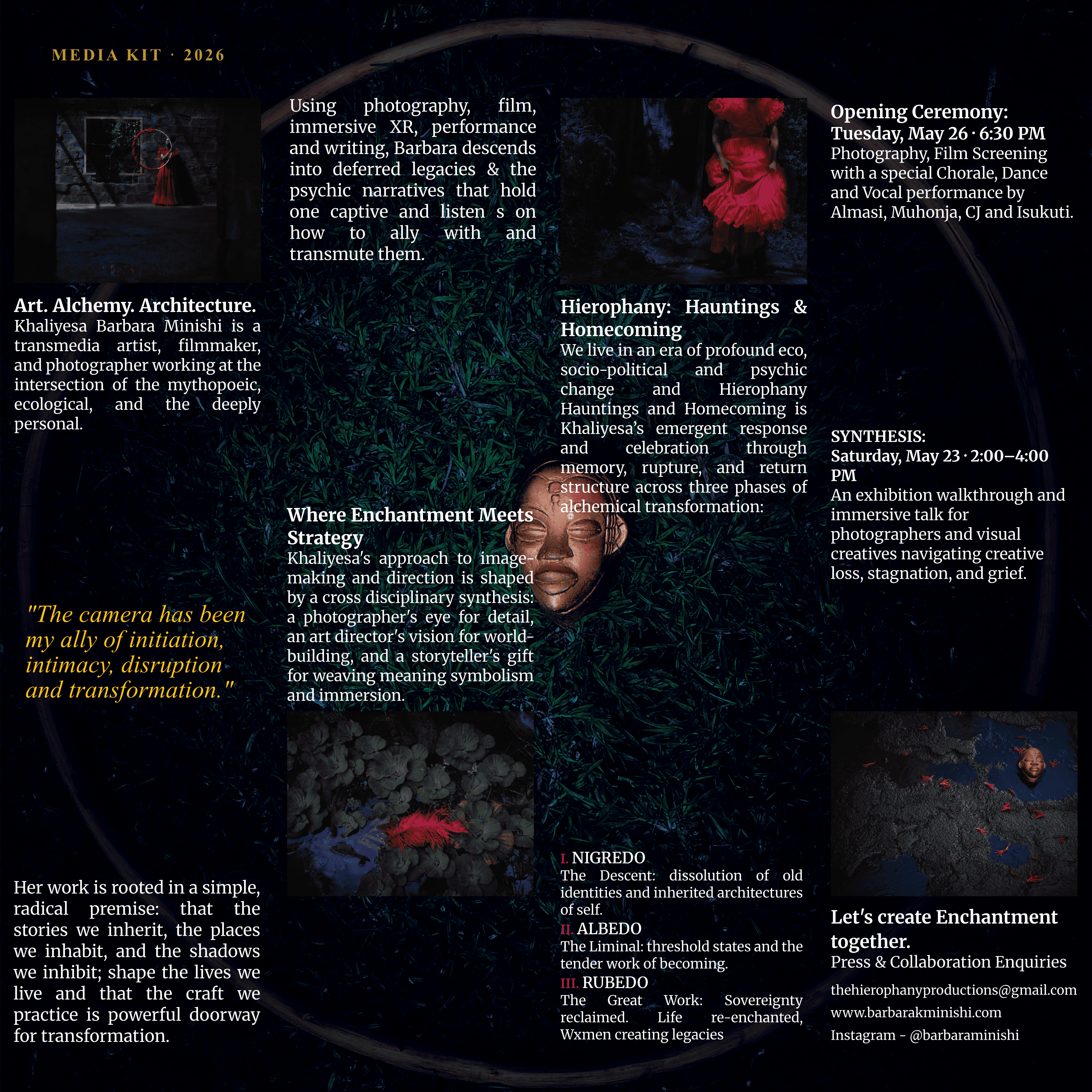
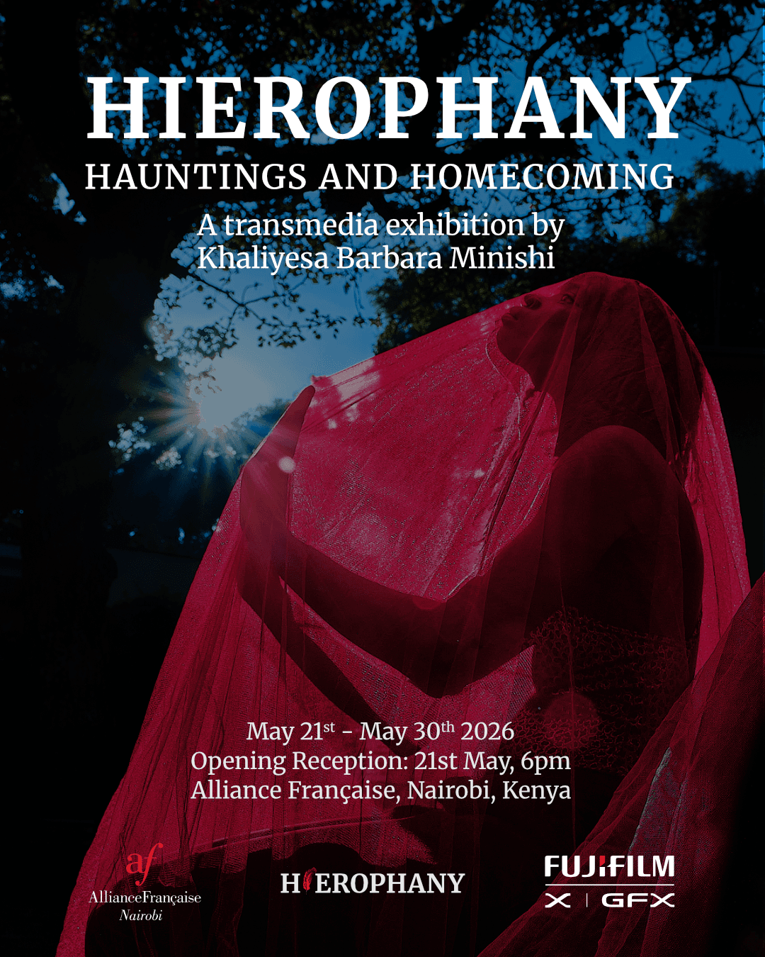
Hierophany is a multidisciplinary art house dedicated to creating spaces for artistic expression, dialogue, and cultural exploration. Ahead of one of its exhibitions, the organization sought a visual identity and supporting print materials that could communicate its distinctive character while establishing a professional and recognizable public presence.
I was brought on to develop key brand and promotional assets, including the logo, exhibition posters, invitation cards, business cards, and a media kit. The project required balancing artistic expression with clear communication, while translating an abstract creative vision into a tangible and cohesive design system.
The Challenge
Unlike projects with clearly defined visual references, Hierophany's vision was rooted in concepts, atmosphere, and artistic intention. The challenge was not simply creating attractive visuals, but understanding and interpreting the deeper identity the organization wanted to communicate.
The initial direction evolved through multiple conversations and feedback sessions, requiring careful listening, flexibility, and a willingness to refine ideas until they accurately reflected the client's goals.
This project reinforced an important aspect of design: successful outcomes often depend as much on communication and collaboration as they do on visual execution.
Discovery & Research
The first phase focused on understanding the organization's purpose, audience, and aspirations.
Through discussions with the client, I explored:
The meaning and significance behind the name "Hierophany."
The atmosphere they wanted audiences to experience.
How they wished to position themselves within the local creative and cultural landscape.
The role visual design would play in supporting future exhibitions and communications.
Rather than imposing a personal aesthetic, I approached the project as an exercise in translation—turning ideas, conversations, and creative ambitions into a visual language that felt authentic to the organization.
Design Process
The project evolved through a highly iterative process built around feedback and refinement.
Defining the Visual Language
The logo served as the foundation for the broader identity system. It needed to feel artistic and distinctive while remaining versatile enough to work across print and promotional materials.
Building Consistency
Once the visual direction was established, I developed supporting assets that shared common visual principles, ensuring consistency across all touchpoints.
Refinement Through Collaboration
Regular feedback sessions played a critical role throughout the project. Rather than viewing revisions as obstacles, I treated them as opportunities to better understand the client's perspective and strengthen the final outcome.
This collaborative process ultimately helped transform an initially abstract vision into a coherent and functional design system.
Collaboration & Communication
One of the most valuable aspects of this project was the close working relationship with the client.
Because much of the project's direction was rooted in interpretation rather than explicit requirements, effective communication became essential. Feedback sessions helped uncover nuances that would have been difficult to capture through a brief alone.
The experience strengthened my ability to:
Listen actively to stakeholder needs.
Translate qualitative feedback into actionable design decisions.
Present design rationale clearly.
Adapt solutions while maintaining creative integrity.
These skills proved just as important as the technical execution of the work itself.
Deliverables
The final project included:
Visual identity and logo design
Exhibition posters
Invitation cards
Business cards
Media kit materials
Supporting print collateral
Together, these assets established a consistent visual presence for the exhibition while providing Hierophany with foundational brand materials for future initiatives.
Outcome & Reflection
The project successfully transformed a conceptual artistic vision into a cohesive visual identity system that could be applied across promotional and organizational materials.
Beyond the final deliverables, the project demonstrated the importance of empathy, communication, and collaboration within the design process. By engaging deeply with the client's perspective and embracing iterative feedback, I was able to develop work that felt authentic to the organization rather than simply reflective of my own preferences.
Hierophany reinforced my belief that design is ultimately an act of interpretation—connecting ideas, people, and experiences through thoughtful visual communication.